


LEAPTEA One Up Ten is chilling in Foshan City, spicing up the tea game with a mix of classic Chinese tea vibes and cool twists like smoky and boozy blends. Tired of the same old tea brand look, One Up Ten aims to stand out visually and level up the tea experience with some serious style.
Why "One Up Ten"? It's inspired by the saying "一上十馀里,携筇始可寻," meaning a leap into something awesome. Sticking to the core philosophy of tea and its Eastern charm, we snagged "One Up Ten" as the brand name. Visually, we're blending traditional Chinese vibes with a modern twist, keeping it fresh and exciting.
When it comes to the brand vibe, we're diving into ink paintings, calligraphy, and text, rocking that ink and whitespace combo. Colors? Black and white rule the scene, with a splash of Eastern-inspired hues for that extra flair. Visually, we're tossing out the traditional Chinese look for a sleek and minimal style. Breaking down text into strokes and turning them into cool graphics, we're shouting out the brand's vibe of "Eastern Essence, Western Form." Get ready for a tea experience like no other!
LEAPTEA 一上十位于佛山市。以中式茶为基底,希望通过融合新风味(如烟熏、与酒类结合等)和创新的产品思维给中式茶带来新的可能。市面的茶饮类品牌形象的同质化,一上十希望通过更新品牌视觉塑造差异化,并提升茶饮类别的质感。「一上十馀里,携筇始可寻」,意为有质变的跳跃,主理人希望坚守茶本身的哲学性和东方属性,因此截取一上十作为品牌名。在视觉上,亦希望在中式元素和美感的基础上融合现代、创新的视觉表达方式,呼应一上十「质变的跳跃」。
基于品牌调性,水墨、书法及文字作为表达品牌的视觉元素,并强调墨与留白,整体的色调以黑白为核心,并在此基础上融入具有东方气质的色彩作为点缀。同时在视觉表达上,放弃使用传统中式视觉元素,以干练、简洁的版式和大面积的视觉留白为主体,同时将文字拆解为笔画再融合创造为图形图腾,借此传达「东意西型」的品牌理念。
Art Director: Mic Mak
Creative Director:Mic Mak
Designer: Mic Mak
Copywriting:Mic Mak
Client:LeapTea


Logotype
The emblem features a fusion of Chinese and English elements, employing a robust black typeface as the foundation. We meticulously adjusted the strokes and terminations, introducing flared endings to straight lines for an enriched visual experience infused with Eastern aesthetics. The iconic symbol revolves around the mighty "一" (the Chinese numeral for 1), selected for its distinctive recognition and profound symbolism. Drawing inspiration from Japanese hiragana, the "一" undergoes a sophisticated transformation, exuding stylishness and graphic finesse.
标识以中英文组合形式,采用黑体字为基底,在笔画的细节和收口位置进行微调,将直线笔画收口位置改为喇叭口,丰富细节之外也增加具有东方气质的视觉调性。图形标识则以「一」作为核心识别图形,主理人认为一更具识别度和代表性。基于视觉张力和制作考虑,「一」表现采用了日本髭文字为蓝本,使其造型感更强,更具有图形特征。


visual elements
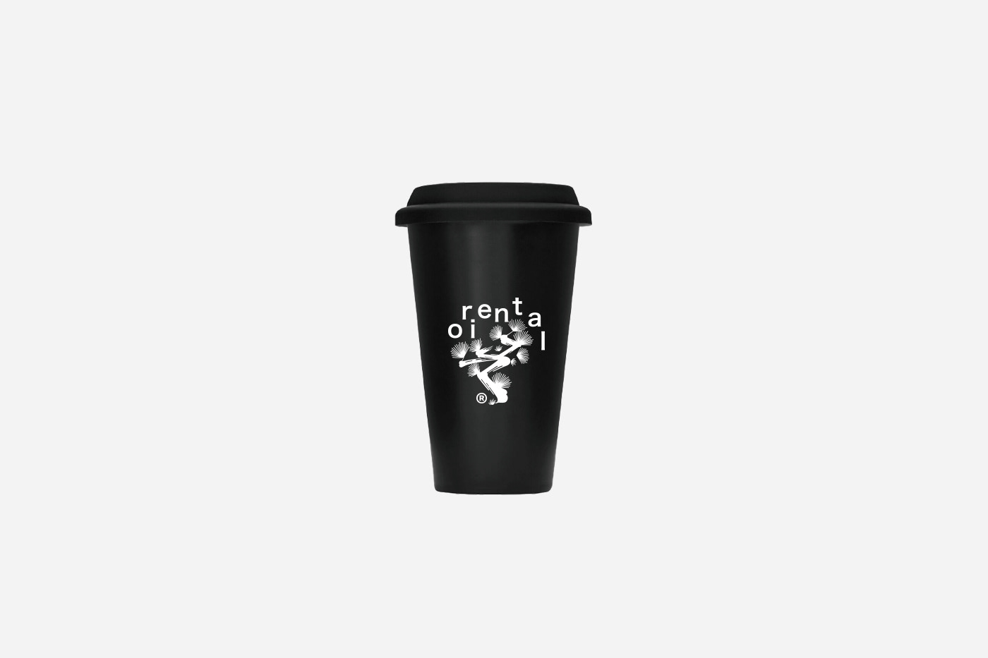
Inspired by the bold strokes of hiragana characters, can we perceive it as a pattern or a composition formed by ink? Under this notion, we crafted additional hiragana strokes and combined them to represent four oriental plants: bamboo, pine, plum, and fern. This not only captures the texture of brush and ink but also distinguishes itself from traditional ink paintings. Through this creative approach, we aim to infuse "一上十" with greater versatility, adding a sense of strength and vitality to its visual identity while maintaining simplicity and whitespace.
既然髭文字的造型感如此之强,能否将其理解为某种图案或者油墨构成的图形呢?在此想法之下我们塑造了更多的
髭文字笔画,并将其组合成为具有东方调性的四种植物:竹、松、梅、蕨,既具有笔墨的质感,又区别于传统水墨画,希望通过这样的处理方式让「一上十」视觉形象更为多变,在简洁留白的基础上增加力量感和活力。
Translated by Google Translate
来自谷歌翻译


Art Director: Mic Mak
Creative Director:Mic Mak
Designer: Mic Mak
Copywriting:Mic Mak
Client:LeapTea


